Animating An ePicturebook: SPLASH!
July 20, 2017
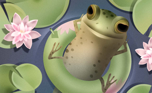
In my last post, I animated the pollywog's tail and rotated the innertube/lily pad. Now I’ll animate the sleep sequence and the dragonfly.
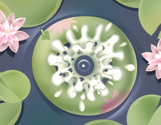
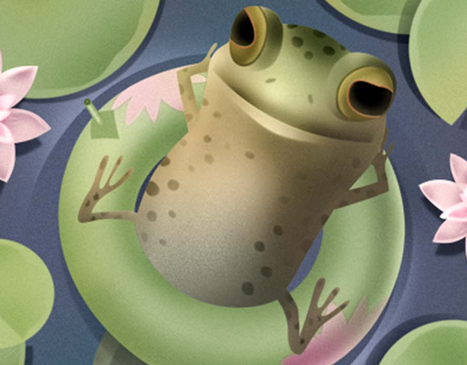
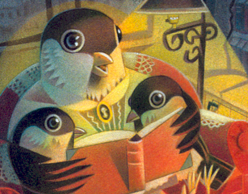
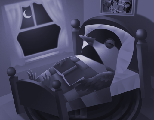
The pollywog sitting on a lily pad is composed of thirteen individual pieces of art. I added the first six images in my last post. Here are the additional seven images (Notice that the pollywog art here has been softened and slightly blurred to enhance the sense of a speedy plunge into the water.):
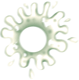
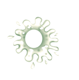
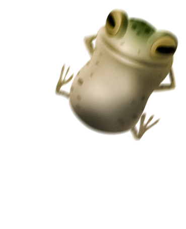
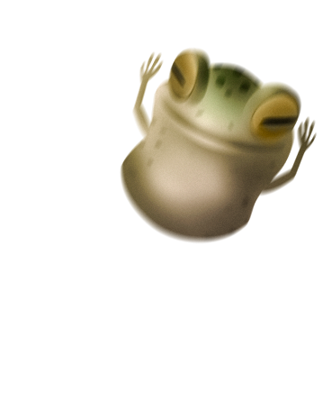


I'll add another div named .animatepollywog to show the pollywog nodding asleep and slipping down into the water with a splash. Here's the HTML:
<body>
 <div id="page11">
	<img class="innertube" src="images/pollywollyinnertube.png" alt="" />
	<img class="lilypads" src="images/pollywollylilypads.png" alt="" />
	<img class="ripples" src="images/pollywollybackground_top.jpg" alt="" />
	<div class="animatepollywog">
		<img class="pollywog" src="images/pollywolly.png" alt="" />
		<img class="sleep1" src="images/pollywolly4blur.png" alt="" />
		<img class="sleep2" src="images/pollywolly5blur.png" alt="" />
		<img class="splash1" src="images/pollywollysplash1.png" alt="" />
		<img class="splash2" src="images/pollywollysplash2.png" alt="" />
	</div>
	<div class="animatetail">
		<img class="tail" src="images/pollywogtail.png" alt="" />
	</div>
 </div>
</body>
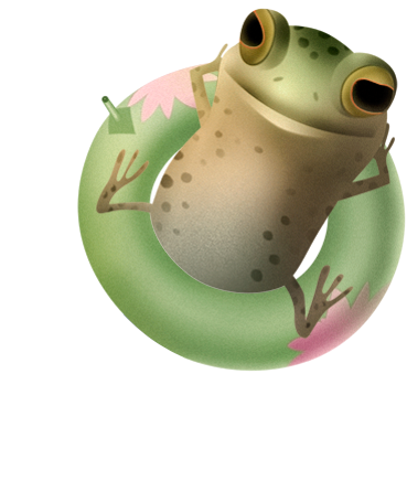
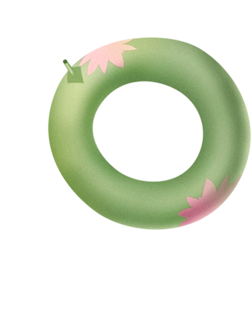
In this animation, the pollywog will fall asleep and disappear underwater, leaving the lily pad/innertube floating on the surface. To accomplish that, the innertube must be rotating in sync (same position and rotation values) under the pollywog-on-innertube image. Though the CSS indicates the pollywog image is positioned top: 0 and left: 0, it's inside the .animatepollywog div which is positioned exactly atop the innertube at top: 90px and left 75px. Now when the pollywog disappears (opacity: 0), I’m left with a single rotating inner tube, giving the affect that only the pollywog is gone, @keyframes animatePollywog.
Here's the relevant CSS styling:
* {
margin: 0;
padding: 0;
}

body {
width: 512px;
height: 600px;
margin: 0 auto;
padding: 0;
}

img.innertube
{
	position: absolute;
	top: 90px;
	left: 75px;
	width: 369px;
	height: 455px;
	z-index: 0;
	padding: 0;
	margin: 0;
	-webkit-animation: rotateInnertube 14s ease-in-out 0s infinite alternate;
}
@-webkit-keyframes rotateInnertube {
0% {
-webkit-transform: rotate(0deg);
}
30% {
-webkit-transform: rotate(-10deg);
}
60% {
-webkit-transform: rotate(5deg);
}
100% {
-webkit-transform: rotate(0deg);
}
}
.animatepollywog
{
	position: absolute;
	top: 90px;
	left: 75px;
	width: 369px;
	height: 455px;
	z-index: 1;
	-webkit-animation: animatePollywog 16s ease-in-out 0s 1 normal forwards;
}
@-webkit-keyframes animatePollywog {
0% {
opacity: 1;
}
90% {
opacity: 1;
}
91% {
opacity: 0;
}
100% {
opacity: 0;
}
}
img.pollywog
{
	position: absolute;
	top: 0;
	left: 0;
	width: 369px;
	height: 455px;
	z-index: 1;
	padding: 0;
	margin: 0;
	opacity: 0;
	-webkit-animation: rotatePollywog 14s ease-in-out 0s 1 normal forwards;
}
@-webkit-keyframes rotatePollywog {
0% {
opacity: 1;
-webkit-transform: rotate(0deg);
}
30% {
-webkit-transform: rotate(-10deg);
}
60% {
-webkit-transform: rotate(5deg);
}
96.3% {
opacity: 1;
-webkit-transform: rotate(0deg);
}
100% {
opacity: 0;
-webkit-transform: rotate(0deg);
}
}
I'll make the pollywog disappear underwater using the sleep and splash sequences: @keyframes pollywogSleep1,@keyframes pollywogSleep2, @keyframes pollywogSplash1, @keyframes pollywogSplash2. It's a simple matter of using opacity declarations to swap out one image for another at various keyframe percentage points, just as I did with the bird alighting on the mantel in my blog post Flying Bird. To add to the splash affect, the two images appear 0.5 seconds apart and I used the scale() transform to make them appear to expand and contract.
img.sleep1
{
	position: absolute;
	top: 0;
	left: 0;
	width: 369px;
	height: 455px;
	z-index: 1;
	padding: 0;
	margin: 0;
	opacity: 0;
	-webkit-animation: pollywogSleep1 .5s linear 13.5s 1 normal;
}
@-webkit-keyframes pollywogSleep1 {
0% {
opacity: 1;
}
50% {
opacity: 1;
}
51% {
opacity: 0;
}
100% {
opacity: 0;
}
}

img.sleep2
{
	position: absolute;
	top: 0;
	left: 0;
	width: 369px;
	height: 455px;
	z-index: 1;
	padding: 0;
	margin: 0;
	opacity: 0;
	-webkit-animation: pollywogSleep2 .5s linear 13.5s 1 normal;
}
@-webkit-keyframes pollywogSleep2 {
0% {
opacity: 0;
}
49% {
opacity: 0;
}
50% {
opacity: 1;
}
100% {
opacity: 1;
}
}

img.splash1
{
	position: absolute;
	top: 72px;
	left: 110px;
	width: 255px;
	height: 257px;
	z-index: 0;
	padding: 0;
	margin: 0;
	opacity: 0;
	-webkit-animation: pollywogSplash1 .5s ease-in-out 14s 1 normal forwards;
}
@-webkit-keyframes pollywogSplash1 {
0% {
opacity: 1;
-webkit-transform: scale(1);
}
45% {
opacity: 1;
-webkit-transform: scale(1.2);
}
50% {
opacity: 1;
-webkit-transform: scale(0);
}
51% {
opacity: 0;
}
100% {
opacity: 0;
}
}

img.splash2
{
	position: absolute;
	top: 72px;
	left: 110px;
	width: 255px;
	height: 257px;
	z-index: 1;
	padding: 0;
	margin: 0;
	opacity: 0;
	-webkit-animation: pollywogSplash2 .5s ease-in-out 14s 1 normal forwards;
}
@-webkit-keyframes pollywogSplash2 {
0% {
opacity: 0;
}
49% {
opacity: 0;
}
50% {
opacity: 1;
-webkit-transform: scale(1);
}
75% {
opacity: 1;
-webkit-transform: scale(0);
}
100% {
opacity: 0;
}
}
Finally, I placed the dragonfly body and two wing images in their containing div named “dragonfly” ( shown below with a white border ). I animated the two wings first, then “flew” the .dragonfly div around the surface of the pond. I could have made a dragonfly sprite sheet showing the wings in different positions, but I knew that rapidly rotating each wing would produce a smoother animation given the extreme wing speed of a dragonfly.
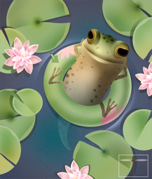
I changed the origin point for the rotation of the left wing from its default center point to its rightmost point (100% on the x-axis and 50% on the y-axis) where it's attached to the dragonfly body, and likewise the rotation of the right wing to its leftmost point (0% on the x-axis and 50% on the y-axis). The wings each rotated through a 40 degree arc from rotate(-20 deg) to rotate(20deg) and back (alternate) every 25 milliseconds for an infinite duration. Note in the CSS that while the left wing rotates first counterclockwise from -20 degrees to 20 degrees clockwise, the right wing is rotating oppositely, from 20 degrees to -20 degrees. This is because their points of origin are at opposite ends of each wing, thus flipping what is clockwise or counterclockwise. To look right, the wing rotations must mirror each other.
Here's the HTML and CSS:
<div class="dragonfly">
		<img class="dragonflybody" src="images/dragonflybody.png" alt="" />
		<img class="leftwing" src="images/dragonflyleftwing.png" alt="" />
		<img class="rightwing" src="images/dragonflyrightwing.png" alt="" />
	</div>
img.leftwing
{
	position: absolute;
	top: 7px;
	left: 0px;
	width: 47px;
	height: 11px;
	opacity: 1;
	z-index: 5;
	-webkit-transform-origin: 100% 50%;
	-webkit-animation: leftwingFlutters 25ms linear 0s infinite alternate forwards;
}
@-webkit-keyframes leftwingFlutters {
0% {
-webkit-transform: rotate(-20deg);
}
100% {
-webkit-transform: rotate(20deg);
}
}

img.rightwing
{
	position: absolute;
	top: 7px;
	left: 50px;
	width: 49px;
	height: 11px;
	opacity: 1;
	z-index: 5;
	-webkit-transform-origin: 0% 50%;
	-webkit-animation: rightwingFlutters 25ms linear 0s infinite alternate forwards;
}
@-webkit-keyframes rightwingFlutters {
0% {
-webkit-transform: rotate(20deg);
}
100% {
-webkit-transform: rotate(-20deg);
}
}

.dragonfly
{
	position: absolute;
	top: 520px;
	left: 400px;
	width: 99px;
	height: 74px;
	z-index: 5;
	-webkit-animation: dragonflyFlies 21s ease-in-out 0s 1 normal forwards;
}
@-webkit-keyframes dragonflyFlies {
0% {
top: 520px;
left: 400px;
-webkit-transform: rotate(-10deg);
}
10% {
top: 520px;
left: 400px;
-webkit-transform: rotate(10deg);
}
25% {
top: 520px;
left: 350px;
-webkit-transform: rotate(-30deg);
}
40% {
top: 515px;
left: 380px;
-webkit-transform: rotate(20deg);
}
50% {
top: 510px;
left: 400px;
-webkit-transform: rotate(-10deg);
}
76% {
top: 500px;
left: 350px;
-webkit-transform: rotate(10deg);
}
82% {
top: 400px;
left: 50px;
-webkit-transform: rotate(-40deg);
}
84.5% {
top: 300px;
left: 225px;
-webkit-transform: rotate(60deg);
}
97.5% {
top: 150px;
left: 100px;
-webkit-transform: rotate(-20deg);
}
100% {
top: 0px;
left: 600px;
-webkit-transform: rotate(60deg);
}
}
That completes my animation, except for this final thought: So that my reader is not distracted while reading my pollywog rhyme, the dragonfly flutters in place for the first 9 seconds before flying away. And I didn’t worry about stopping the animation, I simply flew the .dragonfly div completely off the page, made possible by the page declaration, overflow: hidden. Click HERE to see the final animation.
Next time I’ll delve further into the planning and sequencing of even more complex CSS animations.

