Animating An ePicturebook: Flying Bird
April 15, 2017
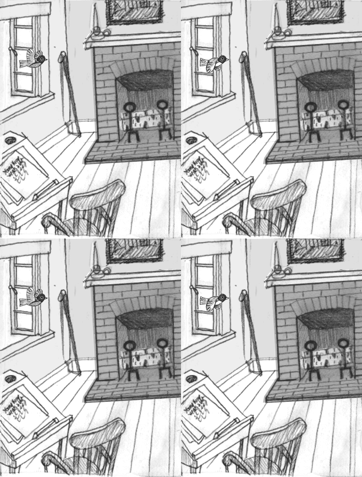
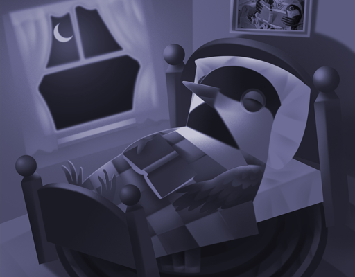
In my last post I created the illusion of a bird flapping its wings using simple CSS animation markup. Now I will fly the bird through the window and across the room to land on the fireplace mantel. The CSS rules that do that are pretty straightforward. Remember when I used a simple opacity “transform” to fade night into morning for the sleeping chickadee in my first book, Polly Wolly Willy Woggle (available as a free download on the iBooks Store)? This time I’ll use a different transform called “translate” to fly the robin across the room.
But before I can “translate” the bird there are several things I must do. First, I have to place the .birdflapping div inside another div that I can then “fly.” Placing one div inside another is referred to, quite appropriately in this example, as “nesting.” When I have more than one animation to apply to an image, I find it easier to separate the animations. In this case I'll separate the wings flapping from the bird flying across the room, giving each motion its own div and its own set of CSS rules. Nesting animated divs is a bit like running in place on a moving train.
Changing the structure of my HTML once more, I moved the .birdflapping div inside another <div> </div> block to which I’ve given a class name of “robin.” I’ve also added a blue border to the .robin div and made the container 88 pixels wide by 72 pixels high, that is, 5 pixels larger all around than the .birdflapping div in order for both div-boxes to be visible for the purposes of this demonstration.
Here's the complete HTML and CSS:
 <?xml version="1.0" encoding="UTF-8"?>
 <html xmlns="http://www.w3.org/1999/xhtml"
xmlns:epub="http://www.idpf.org/2007/ops" xml:lang="en">
 <head>
     <meta name="viewport" content="width=456, height=600" />
     <meta content="text/html; charset=utf-8" />
     <title>Henry's Rhymes From Walden Vol.2 </title>
     <link href="style.css" type="text/css" rel="stylesheet"/>
 </head>
 <body>
     <div class="p03">
    	 <img class="background" src="images/background_p03.jpg" alt="" />
    	 <div class="robin">
    		<div class="birdflapping"> </div>
    	 </div>
     </div>
   </body>
 </html>
html,body,div,img,p,a,ul,li {
	margin:0;
	padding:0;
} /* this is not an exhaustive browser reset */

body {
	width: 456px;
	height: 600px;
	position: relative;
	margin: 10px auto 0;
	padding: 0;
	color: #000000;
	border: 3px solid black;
}

img.background
{
	position: absolute;
	top: 0;
	left: 0;
	z-index: -2;
	width: 456px;
	height: 600px;
	margin: 0;
}

.p03
{
	position: relative;
	z-index: -2;
	width: 456px;
	height: 600px;
	margin: 0;
	overflow: hidden;
}

.robin
{
	position: absolute;
	top: 115px;
	left: -88px;
	z-index: 1;
	width: 88px;
	height: 72px;
	margin: 0;
	border: 1px solid blue;
	-webkit-animation: birdFlying 5s linear 0s 1 normal;
}
@-webkit-keyframes birdFlying {
0% {
opacity: 1;
-webkit-transform: translate(0px, 0px) rotate(0deg);
}
25% {
opacity: 1;
-webkit-transform: translate(0px, 0px) rotate(0deg);
}
100% {
opacity: 1;
-webkit-transform: translate(456px, -95px) rotate(-20deg);
}
}

.birdflapping
{
	position: absolute;
	top: 5px;
	left: 5px;
	width: 78px;
	height: 62px;
	border: 1px solid red;
	background: url('../images/birdflapping.png') top center;
	background-position: 0px 0px;
	background-repeat: no-repeat;
	-webkit-animation: birdFlapping .5s steps(2) infinite;
}
@-webkit-keyframes birdFlapping {
0% {
background-position: 0px 0px;
}
100% {
background-position: 0px -124px;
}
}
Since the .birdflapping div is now inside the .robin div, its position is no longer 120 pixels from the top and 50 pixels from the left of the page. It is now centered 5px from the top and 5 pixels from the left of its containing .robin div. If not for this demonstration, I normally would have made both divs the same size with the inner div positioned at top: 0 and left: 0.
The second thing I did was move the bird to the outside of the window, i.e. move the .robin div off the page to the left so the .birdflapping div it contains won’t be seen flapping “in place” as it is now in front of the window. I can move both divs outside the window by simply giving the containing .robin div a position 115 pixels from the top and -88 pixels from the left of the page (remember that a negative value position on the x-axis places the element outside the left edge of the page).
Now I’m ready to “fly” the .robin div using the @keyframes birdFlying animation. I will move the bird from its starting position, 0% { transform: translate(0px, 0px); } to its end position, 100% { transform: translate(456px, -95px); } using positive pixel values to move right (or down) and negative values to move up (or left). How did I arrive at those pixel values?
For the bird (positioned 88 pixels beyond the left--out of view--and 115 pixels from the top) to end its flight on the mantelpiece 20 pixels from the top and exactly at the right edge of the page, it must travel 95 pixels upward (115 minus 20) and 456 pixels across the page. The vertical movement calculation is expressed as -95 pixels because its movement is in the negative upward direction. For the horizontal movement, the bird begins its flight at -88 pixels (the width of the bird image) and ends 88 pixels from the right edge, thus traveling the width of the page, 456 pixels.
In addition, since the bird is flying up to the mantel, its body should aim in that direction. So I added another transform called “rotate” that allowed me to rotate the .robin div 20 degrees counterclockwise as it traveled from its beginning at 0% { transform: translate(0px, 0px) rotate(0deg); } to the end at 100% { transform: translate(456px, -95px) rotate(-20deg); }. The values for a counterclockwise rotation are expressed as negative degrees.
Finally, I repeated the @keyframes birdFlying 0% declaration again at 25% so that, in effect, nothing happened for the first 1.25 seconds of the animation (0% to 25%). This was a very efficient way to build a delay into the start of the bird’s movement through the window and across the room.
There are a few things left to do before I finish this animation. First, the bird should not be seen flapping in the air off the left side of the page. I added the overflow: hidden declaration to the .p03 div so nothing will be seen beyond the limits of the page. Click here to see the animation so far.
Second, the bird should land on the mantel, not just flap above it, so I drew an additional standing pose for the bird and added it to the HTML as img.robin2. In the CSS, I positioned this image on the mantel 27 pixels from the top and 388 pixels from the left side of the page and gave it z-index: 1.
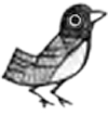
Next, I wrote an animation declaration named @keyframes robinPerched to change its opacity. I want the standing bird to replace the flying bird at 4.9 seconds (98%) of the 5 second animation. Now, I could delay the animation of the standing bird for 4.9 seconds, then give it a starting opacity of 1, but from experience I've learned that, if two animations are to sync up perfectly, it's better to start them at the same time.
So I made robinPerched a 5 second animation with no delay, gave it a linear timing function (it doesn’t change speed), and a one-time iteration in the normal direction. You may wonder why I repeated the “opacity: 0” declaration again at 97.9%. If I hadn't made that declaration, the image of the perched bird would begin to fade in at 0%, and that’s not what I want. I want to quickly switch the flying bird with the standing bird at the exact moment of 98% (4.9 seconds).
All that’s left is to add the opacity declaration to the @keyframes birdFlying animation. It only makes sense that before I can change the flying bird's opacity to 0, it must begin with an opacity of 1 (visible though initially "hidden" off the left of the page). From 0% to 98% the flying bird's opacity is 1, and at 98.1% it disappears with an opacity of 0. Meanwhile, the standing bird's opacity at 98% is also 1.
 <?xml version="1.0" encoding="UTF-8"?>
 <html xmlns="http://www.w3.org/1999/xhtml"
xmlns:epub="http://www.idpf.org/2007/ops" xml:lang="en">
 <head>
     <meta name="viewport" content="width=456, height=600" />
     <meta content="text/html; charset=utf-8" />
     <title>Henry's Rhymes From Walden Vol.2 </title>
     <link href="style.css" type="text/css" rel="stylesheet"/>
 </head>
 <body>
     <div class="p03">
    	 <img class="background" src="images/background_p03.jpg" alt="" />
    	 <img class="robin2" src="images/robin2_p03.png" alt="" />
    		<div class="robin">
    			<div class="birdflapping"> </div>
    		</div>
     </div>
   </body>
 </html>
html,body,div,img,p,a,ul,li {
	margin:0;
	padding:0;
} /* this is not an exhaustive browser reset */

body {
	width: 456px;
	height: 600px;
	position: relative;
	margin: 10px auto 0;
	padding: 0;
	color: #000000;
	border: 3px solid black;
}

img.background
{
	position: absolute;
	top: 0;
	left: 0;
	z-index: -2;
	width: 456px;
	height: 600px;
	margin: 0;
}

.p03
{
	position: relative;
	z-index: -2;
	width: 456px;
	height: 600px;
	margin: 0;
	overflow: hidden;
}

img.robin2
{
	position: absolute;
	top: 27px;
	left: 388px;
	z-index: 1;
	width: 68px;
	height: 72px;
	margin: 0;
	-webkit-animation: robinPerched 5s linear 0s 1 normal;
}
@-webkit-keyframes robinPerched {
0% {
opacity: 0;
}
97.9% {
opacity: 0;
}
98% {
opacity: 1;
}
100% {
opacity: 1;
}
}

.robin
{
	position: absolute;
	top: 115px;
	left: -88px;
	z-index: 1;
	width: 88px;
	height: 72px;
	margin: 0;
	-webkit-animation: birdFlying 5s linear 0s 1 normal;
}
@-webkit-keyframes birdFlying {
0% {
opacity: 1;
-webkit-transform: translate(0px, 0px) rotate(0deg);
}
25% {
opacity: 1;
-webkit-transform: translate(0px, 0px) rotate(0deg);
}
98% {
opacity: 1;
-webkit-transform: translate(456px, -95px) rotate(-20deg);
}
98.1% {
opacity: 0;
-webkit-transform: translate(456px, -95px) rotate(-20deg);
}
100% {
opacity: 0;
-webkit-transform: translate(456px, -95px) rotate(-20deg);
}
}

.birdflapping
{
	position: absolute;
	top: 5px;
	left: 5px;
	width: 78px;
	height: 62px;
	background: url('../images/birdflapping.png') top center;
	background-position: 0px 0px;
	background-repeat: no-repeat;
	-webkit-animation: birdFlapping .5s steps(2) infinite;
}
@-webkit-keyframes birdFlapping {
0% {
background-position: 0px 0px;
}
100% {
background-position: 0px -124px;
}
}
Why would I make both birds visible at 98%? Because it creates an infinitesimal overlap that eliminates any possibility of seeing an annoying white flash of "opacity: 0" during the switch from one image to another. Though your eye would be able to see that flash of white, you won't see the two images overlapped because I’ve set it to happen so quickly. This method of switching from one image to another is important to understand because it’s arguably the most common way that you’ll animate images in CSS. Now I've removed the border declarations on both divs and you can see the final animation here.
So I’ve landed with the bird at the end of this post. Between now and the time I finish Huckaberry Puckaberry Pie and More Rhymes from Walden, these animations might change or be added to, but always balanced with restraint. It’s still a picture book, after all, and the motion and sound I add to it should never distract a child from the rhymes.
Meantime, there are animations more complex to show you before we build a book. Stay tuned, there’s more to CSS animation than flying birds.

