Animating An ePicturebook: Learning To Fly
March 31, 2017
There are many excellent books for learning to write HTML, hypertext markup language, and CSS, cascading style sheets, but what’s important to understand is that this is not program coding, it is markup. So relax, you don’t need to be a programmer to understand or even write HTML and CSS markup. These languages are easily within the grasp of picture book creators.
Let’s look at the markup for the first page of the book I’m currently animating, Huckaberry Puckaberry Pie and More Rhymes from Walden. The HTML page gives names and organization to the contents using “tags”: <html><head><body><div>. Notice that every tag also has a closing tag: </html></head></body></div>. Every image has its own built-in closing tag: <img…/>. The div tag is especially useful. It acts as a container, allowing me to target the images or text I put inside, between the <div> and </div> tags. I can then write CSS rules that apply to the images or text to change their visibility, opacity, scale, rotation, or even the movement of the div itself.
HTML
<?xml version="1.0" encoding="UTF-8"?>
<html xmlns="http://www.w3.org/1999/xhtml"
xmlns:epub="http://www.idpf.org/2007/ops" xml:lang="en">
<head>
    <meta name="viewport" content="width=456, height=600" />
    <meta content="text/html; charset=utf-8" />
    <title>Henry's Rhymes From Walden Volume2</title>
    <link href="style.css" type="text/css" rel="stylesheet"/>
</head>
<body>
    <div class="page03">
    	<img class="background" src="images/background_page03.jpg" alt="" />
    	<img class="robin03" src="images/birdflying_page03.png" alt="" />
   </div>
</body>
</html>
While HTML organizes the structure, the CSS file determines what that structure looks like on the page. In an animated picture book, HTML inserts the text and images and CSS positions that text and animates the images using rules. The CSS markup looks quite different from HTML. It consists of a list of elements such as images, divs, paragraphs, etc., each with its own style declarations/rules within a set of curly braces: { and }.
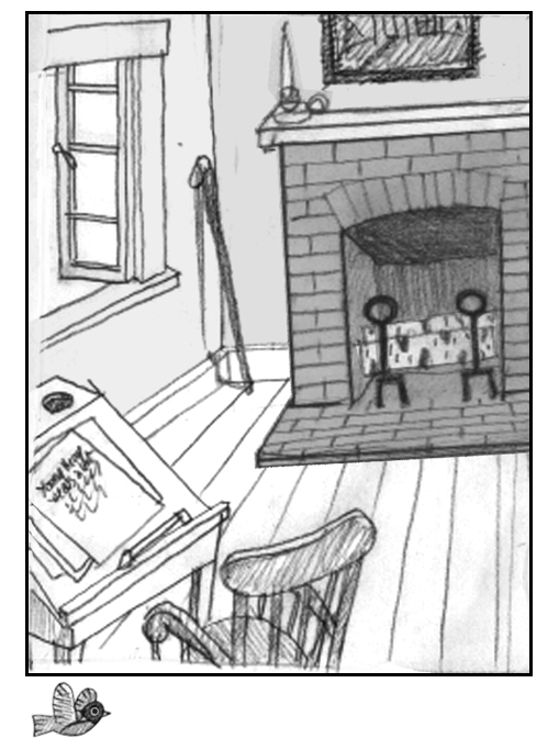
This HTML tells us that the “viewport,” or viewing window, is 456 pixels wide by 600 pixels high and contains two images: background_page03 and bird flying_page03. I’ve placed these images inside a <div> </div> block named page03. The source for these images (“src”) is a folder named “images.” Note that the bird flying is a png file because the bird is silhouetted on a transparent background.
CSS
body {
width: 456px;
height: 600px;
margin: 0 auto;
padding: 0;
color: #000000;
border: 3px solid black;
}
.page03 {
position: relative;
width: 456px;
height: 600px;
margin: 0;
}
img.background {
position: absolute;
top: 0;
left: 0;
width: 456px;
height: 600px;
margin: 0;
z-index: -2;
}
So far there are only enough css rules to tell us that the “body” of our page is the same size as our “viewport,” meaning that our page will exactly fit the viewing area on our device with a “margin” or space at the top of 10 pixels. The value “auto” centers the page in any viewing window. I’ve added a 3-pixel border to better show the limits of the page.
As you can see, the bird is outside the page. This is because HTML inserts images in the viewing window in the order they are written. Since the background image is listed first and is the same size as the page, it pushes the bird outside the page. To change that, I need to add some CSS rules to the bird that will place it on the page at the open window. How do I create a rule that will apply specifically to a particular image?
The answer is to assign a “class name” to the image. In CSS-speak, the period before an element (.page03) is the notation for a class name. Class names are a way to label elements to distinguish one from another. I’ve given the class name “background” to the background image so I can write style for that image that won’t be applied to the image I’ve given the class name “robin03.” You can chose whatever class names you want, but it’s helpful if the name describes the meaning of the element it’s applied to. A hashmark # is the notation used when an element has been given an “id attribute” rather than a class name. I use class names to target elements more often than id attributes because id is a unique identifier and can only be used once in the CSS.
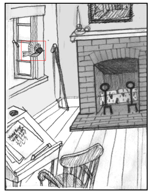
img.robin03 {
position: absolute;
top: 120px;
left: 50px;
width: 78px;
height: 62px;
margin: 0;
z-index: 1;
border: 1px solid red;
}
Positioning images on a page is very simple using CSS. Everything is placed relative to the top left corner (position 0px, 0px). For this example, the bottom right corner is position 456px, 600px. The top right corner is position 456px, 0px. And the bottom left corner is position 0px, 600px. Positions with negative values are outside the top and left side of the page. A position greater than 456 pixels on the x-axis would be outside the right side of the page while a y-axis position greater than 600 would be below the bottom of the page. The background drawing of the room is the same size as the page so I only need to “pin it” to the top left corner, 0 pixels from the top and 0 pixels from the left, to fill the page.
You need not be concerned at this point with the distinction between “relative” and “absolute” positioning in the CSS. Since our final goal is to produce a fixed-layout animated e-book designed specifically for an Apple device (the subject of a future post!) virtually every image or block of text will be positioned absolutely on the page. I gave the overall page div (.page03) a relative position so all the other divs, images, and text can be positioned absolutely relative to the page.
The drawing I made of the flying bird is 78 pixels wide by 62 pixels high. To help you see its placement, I’ve added a red border around it and positioned it 120 pixels from the top of the page and 50 pixels from the left. The two images are both now located on the page, but if the background is on top, it will cover and hide the bird. To prevent that, I wrote a CSS rule called “z-index” that sets the stacking order of elements on the page. The higher the number, the higher up the stack. I’ve given the background a z-index of -2 and the bird a z-index of 1 so it will be on top and visible flying into the room.
If this were a normal print picture book, my work would be done—the bird is flying into the room. But this is an animated picture book, and that bird is not flapping its wings! How can I make it do that?
That will be the subject of my next post.

