Animating An ePicturebook: Think Small
March 29, 2017
For a lot of people, and creators in particular, the printed picture book is a sacred object, revered for it’s quiet yet powerful influence on young minds. So when I speak of animating a picture book, I’m certain a lot of eyebrows are raised in consternation. It brings to mind images of Saturday morning television cartoons run amok. But that’s not the sort of animation I’m going to write about here. Thankfully, CSS animation is not (yet) a tool for full-scale cartoon production, but like the internet’s annoying banner-ad GIFs, the possibility of abuse exists. Use restraint.
For me, animating a picture book is more akin to “transformation” than to frenetic Road Runner clips. Think “small changes to small things.” The next to last rhyme in my first volume of Mother Nature Rhymes was inspired by this thought from Thoreau:
“Only that day dawns to which we are awake. There is more day to dawn. The sun is but a morning star.”
Here’s the rhyme I wrote:
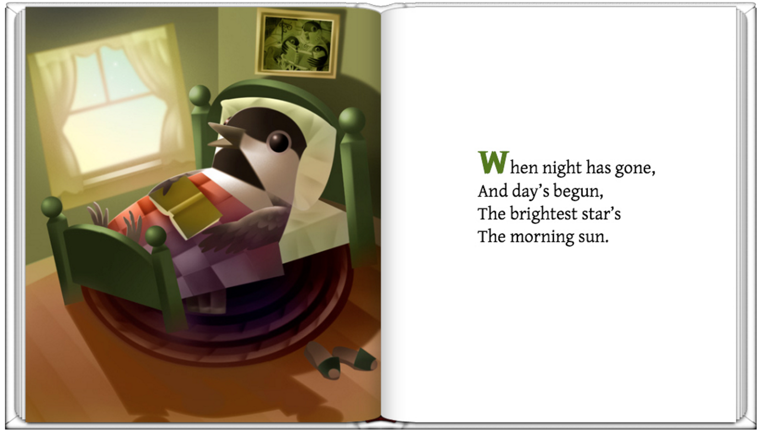 (Click image to play animation.)
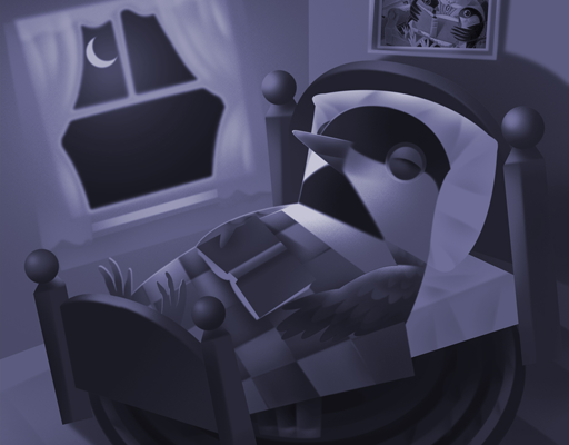
Quite appropriately, CSS keyframe animations are named “transitions” and “transforms.” For the “Brightest Star” animation, I created a morning scene of a waking chickadee, duplicated it with a few small changes into a star-filled night using Photoshop, and positioned them, night atop day, on the page. I find it helpful to draw a rough timeline of my animations, in this case to show how my night scene would slowly fade out to reveal the morning image underneath.
 Here’s the CSS styling for the nightDay animation.
/* This is the page that contains the “bottom” day image */

#page30 {

	background-image: url(images/bottom.jpg);
	position: relative;
	width: 512px;
	height: 600px;
	margin: 0;
	opacity: 1;
	z-index: -3;
}

img.top {
	position: absolute;
	top: 0;
	left: 0;
	width: 512px;
	height: 600px;
	margin: 0;
	opacity: 1;
	z-index: 1;
	animation: nightDay 20s ease-in-out 0s infinite normal;
	/* CSS animations are written in this order: Name/Duration/Timing/Delay/Iterations/Direction */
}
@keyframes nightDay {
0% {
  opacity:1;
}
33% {
  opacity:1;
}
66% {
opacity:0;
}
90% {
opacity:0;
}
100% {
opacity:1;
}
}
(Note: There are many excellent books for learning to write HTML, hypertext markup language, and CSS, cascading style sheets—languages that are easily within the grasp of artists, writers and designers—so I will not delve deeply into that here, other than to point out what certain animation properties are doing on the page.)
The code for the top image (img.top) specifies that its position is absolute, it is visible because its opacity is 1, and it has a z-index greater than the bottom image, placing it atop the stacking order. The animation is named nightDay with a duration of 20 seconds. Ease-in-out timing simply means that the animation begins slowly, speeds up then slows at the end. There is no delay of the start of the animation (0s) and night will continue an infinite number of times fading out, then in, each time revealing the sunrise.
You may wonder why I didn’t simply fade night out from 50%-100% and specify that the infinite repetition reverse at the end, fading back into night (“alternate” instead of “normal” direction). That would have made for a simpler animation, but the soundtrack* would also have had to loop back to stay in sync. It was easier to loop the sound and animation in a normal direction, and end the animation with night so that when the repeat jumped back to the beginning there would be no jarring visual day/night jump.
The slow fade-in-out can feel like a “small” transformation and is a perfect fit for a picture book. In my next post, I’ll apply this same approach to animating a character. *The animation audio is set to “auto-play” and will not be heard on the iPad.

