Animating An ePicturebook: Pollywog Tails Part2
July 07, 2017
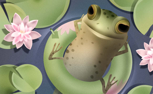
Up till now I’ve been demonstrating short bits of CSS animation. Now I want to show you what goes into a full complement of animations for a typical page from my picture book, Polly Wolly Willy Woggle. (The complete book of rhymes is available as a free download on the iBooks Store.)
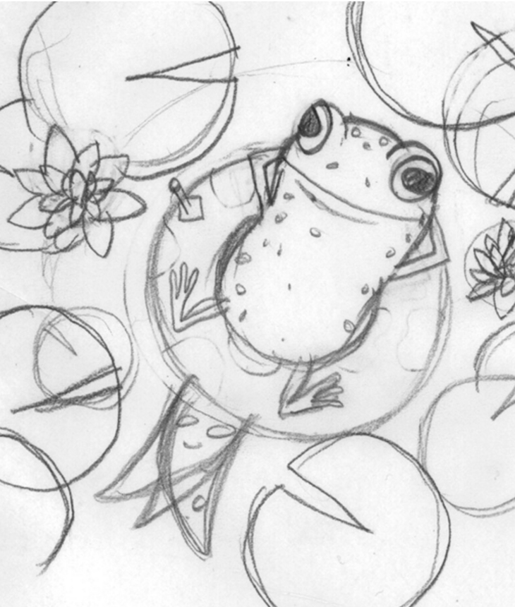
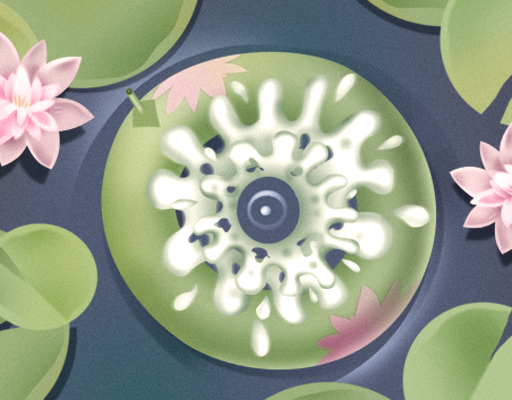
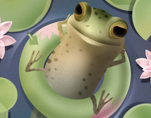
What you perceive as one 30 second animation is actually many separate animations of individual images. To get them all working seamlessly together requires planning. I begin each project with a sketch and a script of what I want to happen and in what sequence: a pollywog reclines on what appears to be a lily pad, and as he moves his tail underwater, both he and the lily pad rotate slowly back and forth. The pollywog falls asleep and splashes down into the water, leaving the green inner tube floating on the pond. Meanwhile a dragonfly buzzes above the lily pads.
Next, I break down my script into movements: the pollywog, its tail, and the inner tube will rotate, the dragonfly will move and also rotate, and the sleep and splash images will flash by in rapid sequence by turning their opacity on and off.
Once I’ve established what each part of my picture will do, I sketch the separate pieces of art and scan them into Photoshop to be painted and cropped to size. There are thirteen pieces. All will be animated except the lily pad image.
For the moment let’s disregard the sleep and splash images as well as the dragonfly, and add all the other images to the HTML, beginning with the bottom-most image (pollywollybackground_bottom.jpg) and ending with the top-most image, the pollywog reclining on the inner tube.
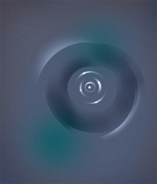
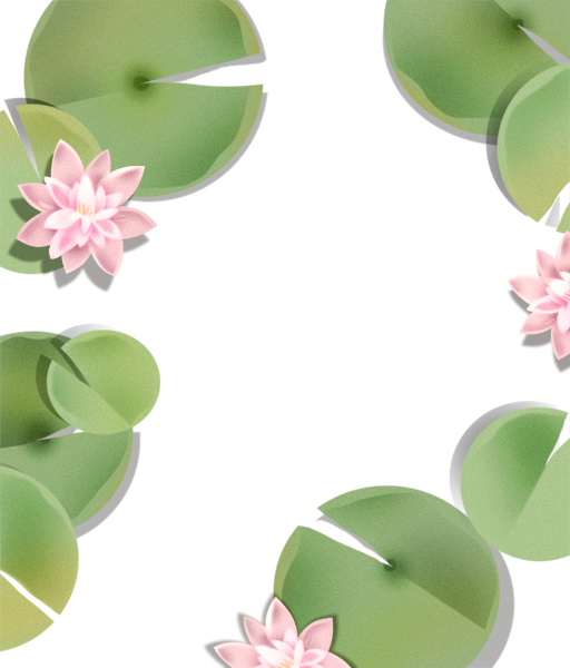
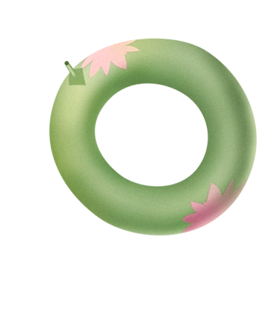
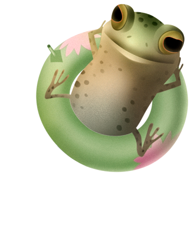
To simplify things, I’ve placed the CSS styling in the <head> of the HTML file just before the closing </head> tag instead of creating and linking to a separate external style sheet.
<?xml version="1.0" encoding="utf-8"?>
<!DOCTYPE HTML PUBLIC "-//W3C//DTD XHTML 1.0 Transitional//EN"
"http://www.w3.org/TR/xhtml1/DTD/xhtml1-transitional.dtd">
<html xmlns="http://www.w3.org/1999/xhtml">
<head>
    <title>Polly Wolly Willy Woggle</title>
    <meta http-equiv="content-type" content="text/html; charset=utf-8" />
    <meta name="description" content="A pollywog pretends to be a bullfrog
    in this CSS animation from Mother Nature Rhymes, an animated picture
    book by D. B. Johnson." />
<style type="text/css">
* {
margin: 0;
padding: 0;
}

body {
width: 512px;
height: 600px;
margin: 0 auto;  /* this centers the page in the browser window */
padding: 0;
}

#page11{
    position: relative;
    width: 512px;
    height: 600px;
    margin: 0;
    overflow: hidden;
}

img.ripples{
    position: absolute;
    width: 512px;
    height: 600px;
    padding: 0;
    margin: 0;
}

img.lilypads{
    position: absolute;
    width: 512px;
    height: 600px;
    padding: 0;
    margin: 0;
}

img.innertube{
    position: absolute;
    width: 369px;
    height: 455px;
    padding: 0;
    margin: 0;
}

img.pollywog{
    position: absolute;
    width: 369px;
    height: 455px;
    padding: 0;
    margin: 0;
}

img.tail{
    position: absolute;
    width: 151px;
    height: 177px;
    padding: 0;
    margin: 0;
}
</style>
</head>
<body>
	<div id="page11">
        	<img class="ripples" src="images/pollywollybackground_bottom.jpg"  />
        	<img class="ripples" src="images/pollywollybackground_top.jpg" />
        	<img class="lilypads" src="images/pollywollylilypads.png"  />
        	<img class="innertube" src="images/pollywollyinnertube.png"  />
        	<img class="pollywog" src="images/pollywolly.png"  />
        	<img class="tail" src="images/pollywogtail.png"  />
	</div>
</body>
</html>
Don’t be intimidated by those <div> tags. A div is simply a structural element (a container) that allows me to divide and group other elements in the body content of a page. When I want certain styling rules to apply to a group of images or text, I enclose those elements within <div> </div> tags, give the div a name like <div id=“page11”> and write rules that will apply to that div and everything inside it. The CSS rules (above) for #page11 specify the page is 512 pixels wide by 600 pixels high, its position is relative, the margin space all around is 0 pixels, and any elements that overflow the page boundaries are hidden. By designating relative positioning for the container div (#page11) I’ve made the page the reference point for positioning all the elements inside it. They can now be absolutely positioned, relative to the top left corner of page 11.
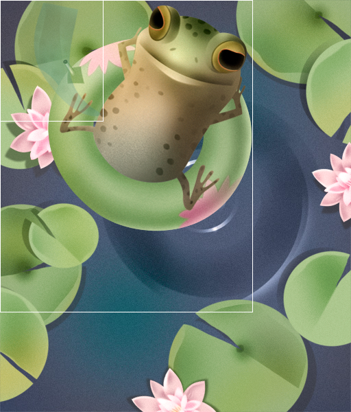
By default the six images are pinned to the top left corner of the page (top: 0px; left: 0px;) as shown. The two ripples images and the lily pads are the same size as the page, putting their top and left positions at the default 0 pixels which is where they should be. The pollywog-on-an-inner-tube and the single inner tube ( both 369 pixels by 455 pixels) can now be positioned 90 pixels from the top and 75 pixels from the left (you can’t see the single inner tube image because it’s the same size and hidden beneath the pollywog image). Once the tail is positioned 350 pixels from the top and 150 pixels from the left edge of the page, I’m ready to animate it.
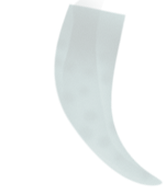
The tail was painted lightly to give it the appearance of being underwater. You will recall that I placed the tail in my HTML file between the top ripples image and the lily pads. And that means that all the images that follow it in the HTML are on top of it on the page (the lily pads, the inner tube, and the pollywog).
Notice that the tip of the tail is curved to the right. You can imagine when the tail rotates left, it will look perfect. But when it swings back to the right, the tail should then curve to the left. How can it do that? Well, I could create a second image with the proper curve, but there’s an even easier way that won’t add more images to my file: by applying a transform: scale() declaration to my tail image animation. Here's how that works: If transform: scale(1,1) is a normal un-scaled image, then transform: scale(-1,1) flips an image horizontally (declaring a negative x-axis value) and transform: scale(1,-1) flips it upside-down (declaring a negative y-axis value). So I wrote a keyframe animation named flipTail that will quickly flip the tail on its horizontal axis to its mirror image at the end of each swing.
When I target an image in this way with two animations (“flipTail” and “rotateTail”) I like to separate the animations by creating two animatable elements, a div and the image I’ve placed inside it. Placing an image inside a container div is a perfect example of the usefulness of divs: they can be added for the sole purpose of targeting them to do a particular job—in this case, to rotate the image. Now I can flip the image and, at the same time, rotate its container divß. I named the div “animatetail.”
The revised HTML looks like this:
<div id="wrapper" class="mothernature">
    <div id="page11">
        <img class="ripples" src="images/pollywollybackground_bottom.jpg"  />
        <img class="ripples" src="images/pollywollybackground_top.jpg" />
        <div class="animatetail">
            <img class="tail" src="images/pollywogtail.png" alt="" />
        </div>
        <img class="lilypads" src="images/pollywollylilypads.png"  />
        <img class="innertube" src="images/pollywollyinnertube.png"  />
        <img class="pollywog" src="images/pollywolly.png"  />
    </div>
</div>
In the CSS the .animatetail div is the same size (151 pixels by 177 pixels) as the tail image and positioned where the tail image was: 350 pixels from the top and 150 pixels from the left edge of the page. Since the tail image is inside its container div, its new position is 0 pixels from the top and 0 pixels from the left of the .animatetail div.
The animation rotateTail is applied to the .animatetail container. It rotates the div (and the tail image inside) 55 degrees to the left (positive degrees are clockwise) and back to the right every 8.4 seconds. I want to rotate it from the base of the tail. Since images rotate from their center point by default, I opened my image in Photoshop and calculated that the rotation point should be up and slightly right, 52% from the left edge and 18% from the top. I add those values to my webkit-transform-origin function. For the moment I’m specifying that this rotation continue infinitely. I’ll change that later when I put this animation in the context of all the other animations on the page.
The animation flipTail is applied to the tail image itself. The image flips to its mirror-image at the end of the first rotation left (at 50%) and flips to the original image again at the end of its rotation back to the right ( at 99.9%). Since each mirror-image flip occurs for just .1% of the 8.4 second animation (.0084 seconds) it will appear to be a smooth transition. For the moment, this animation will also continue infinitely. In the demo I've hidden the top images of the pollywog and added a red border to the .animatetail div. I also added a white border to the img.tail and slowed down the transform so you can see how the flip works HERE.
.animatetail
{
    position: absolute;
    top: 350px;
    left: 150px;
    width: 151px;
    height: 177px;
    -webkit-transform-origin: 52% 18%;
    -webkit-animation: rotateTail 8.4s ease-in-out 0s infinite normal forwards;
}

@-webkit-keyframes rotateTail {
0% {
-webkit-transform: rotate(0deg);
}
50% {
-webkit-transform: rotate(55deg);
}
100% {
-webkit-transform: rotate(0deg);
}
}

img.tail
{
    position: absolute;
    top: 0px;
    left: 0px;
    width: 151px;
    height: 177px;
    padding: 0;
    margin: 0;
    opacity: 1;
    -webkit-transform-origin: 52% 50%;
    -webkit-animation: flipTail 8.4s ease-in-out 0s infinite normal forwards;
}

@-webkit-keyframes flipTail {
0% {
-webkit-transform: scale(1,1);
}
50% {
-webkit-transform: scale(1,1);
}
50.1% {
-webkit-transform: scale(-1,1);
}
99.9% {
-webkit-transform: scale(-1,1);
}
100% {
-webkit-transform: scale(1,1);
}
}
This rotating tail animation would seem more convincing if the pollywog and its inner tube made a small counter-rotation with each swing of the tail. For that I wrote an animation named rotatePollywog that matches the rotateTail but with an opposite, smaller rotation of -10 degrees (negative values are counter-clockwise). I applied rotatePollywog to both the pollywog-on-an-inner-tube image and the image of the inner tube beneath it. Remember, my original scenario called for the animation of these two images to be synced such that when the pollywog slips into the water, the rotating inner tube is left on the surface of the pond.
Here’s the additional CSS:
img.innertube{
    position: absolute;
    top: 90px;
    left: 75px;
    width: 369px;
    height: 455px;
    padding: 0;
    margin: 0;
    -webkit-animation: rotatePollywog 8.4s ease-in-out 0s infinite normal forwards;
}

img.pollywog{
    position: absolute;
    top: 90px;
    left: 75px;
    width: 369px;
    height: 455px;
    padding: 0;
    margin: 0;
    -webkit-animation: rotatePollywog 8.4s ease-in-out 0s infinite normal forwards;
}

@-webkit-keyframes rotatePollywog {
0% {
-webkit-transform: rotate(0deg);
}
50% {
-webkit-transform: rotate(-10deg);
}
100% {
-webkit-transform: rotate(0deg);
}
}
That’s it. We have our pollywog reclining on its inner tube, swinging its tail endlessly back and forth. You can almost hear the buzzing of that dragonfly, but you can’t see him yet. That’s for my next post! Click HERE to see this stage of our pollywog animation.

